A clear, scalable design workflow and file structure built around designers and non-designers to boost collaboration.
The Digital Transformation program was running 3 major releases simultaneously against a fixed deadline. Requirements arriving in massive bulk waves, creating mountains of debt before the work had even properly begun. Designers had little room to breathe, let alone craft an ideal experience.
If a designer steps outside the lane, even with good intentions, and design became a blocker to everyone downstream. That meant the architects, developers, marketing, the release date will be affected itself.
The inevitable trade off: Detached components, messy file structures, designs built for speed rather than scale.
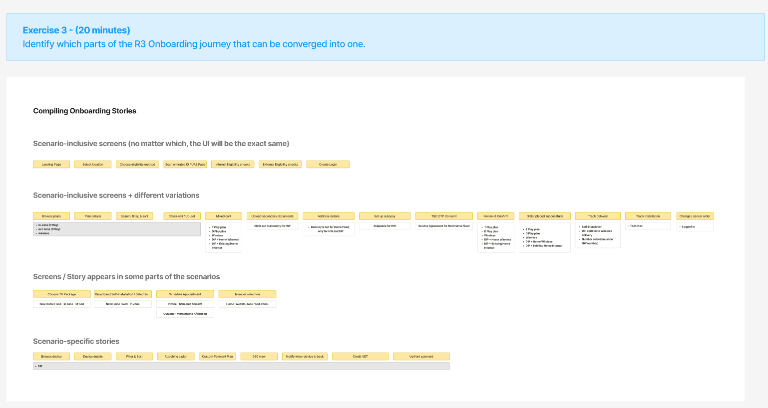
⁉️ POP QUIZ!
How many personas and journeys you see from the screenshot below?

You can contact me for the answer 😜
That is just one example across dozens of other files with their own structure. Regardless, if it takes you more than 10 seconds to guess, then you're looking at the problem right there.
Designers were spending 60% of their time copy-pasting existing designs and adapting them to new requirements. Stakeholders had it worse, every delivered journey meant another one-hour alignment session just to get everyone on the same page.
The question is: How might we build a file structure that works for everyone, designers who live in it daily, and stakeholders who just need to find what they're looking for without asking?
(Re)Understanding the end-to-end flow
Before rolling anything out program-wide, I needed a low-risk proving ground — somewhere flexible enough to absorb changes without derailing anything critical. One newly started project fit perfectly.
I partnered with the Lead Designer and Lead Product Owner to break down existing personas and journeys, cross-referenced everything against our Jira features, and explore if there's any noticeable patterns in this spaghetti-fied file
I mapped reusable features hiding within those journeys and linked them together to test a hypothesis I'd had from the start. Most of these journeys weren't separate, just the same thing wearing different labels.
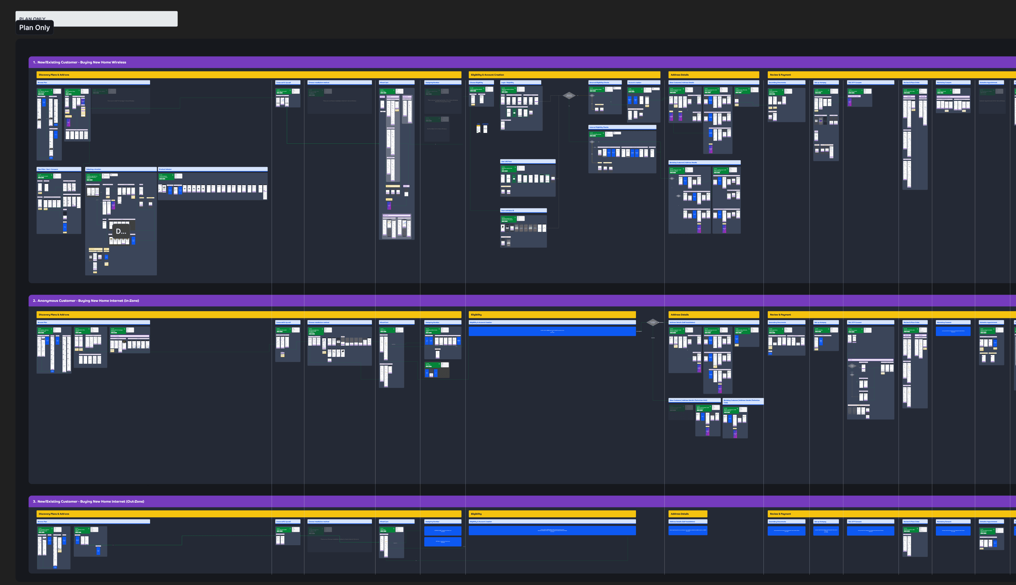
I concluded the workshop with a consolidated journey map. The whole thing was connected from start to finish. Entry points may vary, but the map showed exactly where the lines converged, where they split, and where they ended.
Everything is one coherent picture of the entire journey landscape. but one coherent picture of the entire landscape from start to finish.
Hence the name: Metro Line-ification.


Reordering every journeys one-by-one, by hand
With the workshop done, I built a migration plan across all 3 channels, tackling them one at a time in deliberate order. I started with the Customer App, at the time the UIs were all already signed off, making it the lowest-risk place to lay the foundation.
The catch: App development had already kicked off, meaning direct changes to the live file risked disrupting the build. So as an alternative I used Figma Branches, a contained environment where I could implement the full restructure cleanly without touching anything live.
To get this new structure signed off and used across the whole organisation, here's what I did in summary:
Demoed it to 30+ developers and 3 Product Owners to determine how many hours they could save in finding the right files.
Presented it to Director of Product Management to get his approval to use this across the whole company, framing it as a natural extension of the workflow I had previously built.
The first signed off iteration of the consolidated file structure
Outcome
I personally oversaw the file structure migration across every project and make sure every designer was properly equipped. Time by time, this workflow became the standard for the entire design organisation within du, with all members have slowly adopted and properly use this format.

One of the adoptions created by the other designers with the same format I had built
Reduced the cognitive load for stakeholders to understand the end-to-end flow of a project
Reduced an average of 2 meetings
Reduced redundant Team’s messages e.g “Where can I find ‘Project XYZ’?”
Reduced stakeholder’s time to independently search the exact screens from 1-2 hours to ~10 seconds
Reduced Figma file memory by 25% on average, by reducing the number of redundant screens
Let’s get in touch 🤙🏼
I'm always open to conversations about Design Operations, design team building, or just exchanging notes on what's working and what isn't in the design industry.
Whether you're looking to bring on a DesignOps expert, want to collaborate, or just want to geek out about anything in general, feel free to contact me!
Reach me out